
01
HBO Max Design System
Role
Associate Creative Director
Additional Credits
Design
Art Director - Heather M
Design - Selina L
Design - Justin G
Design - Chika O
Design - Zac F.
Design - Rachel M.
Design - Joe
Product
Visual Designer - Natalia
Product Manager - Hakha M (Co-Lead)
Leadership
Sr.Creative Director - Matt S.P
VP, Product - Michael M
About
This system is the result of a five-year collaboration between the brand design, product content expression, and core teams, serving as an internal incubator for innovation in the HBO Max app. The updated design unifies branding, lifecycle, and merchandising into a single cohesive visual experience, ensuring that every touchpoint—from the home screen to detail pages and collections—reinforces the premium quality of the experience and content. Centering the cinematic universe and award‑winning series and films as the heroes of the platform, the interface gives major franchises, tentpole releases, and acclaimed originals more prominent and consistent presence, helping viewers quickly grasp the breadth and quality of HBO Max’s offering. By tightly aligning visual design with marketing campaigns and merchandising strategy, the app highlights premieres, franchises, and curated collections in an intentional, premium way that both looks cinematic and guides users to discover the stories that define the HBO Max experience.
The Brief
-
Design consistency
Balancing a unified visual style with the need for flexibility across many different components, content types, and use cases.
Ensuring that unique component styles still feel like they belong to the same overall HBO Max design system.
-
Component uniqueness
Defining visual rules so each component feels distinct and purposeful without creating visual noise or redundancy.
Avoiding overlap between component styles as the library grows and new patterns are introduced over time.
-
Scalability and global use
Building a system that can scale across campaigns, markets, and languages while preserving clarity, hierarchy, and brand recognition.
Accounting for regional content priorities, localization needs, and varying marketing strategies without fragmenting the core design language.
Process
*
Process *
Define distinct visual treatments for each component so that every element feels unique, purposeful, and aligned with its specific role in the interface.
/ 1
/ 2
Develop a cohesive visual design language for key components within the HBO Max experience, ensuring a clear, recognizable style that supports the brand’s storytelling focus.
/ 3
Create a scalable system that can flex across campaigns, content genres, and global markets while maintaining consistency and adaptability over time.
Big ideas, real impact.
Aesthetic Principles
/1
ATMOSPHERIC
Create a distinctive mood and communicate powerful emotions.
/3
FOCUSED
Place talent at the center of the frame to convey their emotions.
/2
LAYERED
Create cohesion across different visual elements.
/4
UNFORGETTABLE
Showcase the iconic moments from our series and movies.
Over the course of this project, I was apart of shape a high-quality, award‑winning design experience that elevated how our product shows up in the world. Partnering closely with cross‑functional teams, co‑creating a cohesive visual design language that now underpins our product experiences and establishes our team as the in‑house powerhouse for visual design.
Together, we built a culture of craft and collaboration—pushing each other, growing our skills, and raising the bar on what great looks like. Our work has influenced global campaigns, strengthened the brand, and supported multicultural initiatives, ensuring our design system resonates with diverse audiences across markets.
Usability Principles
/1
READABILITY
Strong color contrast and font sizes play a vital role in ensuring that text is readable, especially for users with low vision.
/3
ORIENTATION
Place talent at the center of the frame to convey their emotions.
/2
PREDICTABILITY
Designs should make it possible for users to accurately predict the outcomes of their interactions based on presented visuals and copy.
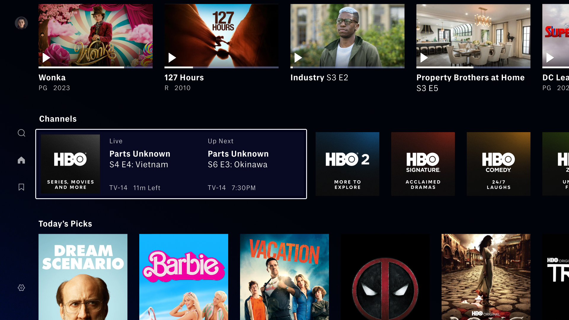
Channels
Redefining Visual Dynamics Through Scale and Texture, Max Channels presents a distinctive perspective on imagery that stands out. Our approach focuses on manipulating scale and texture to create a unique brand aesthetic that diverges from traditional collection images and hubs.
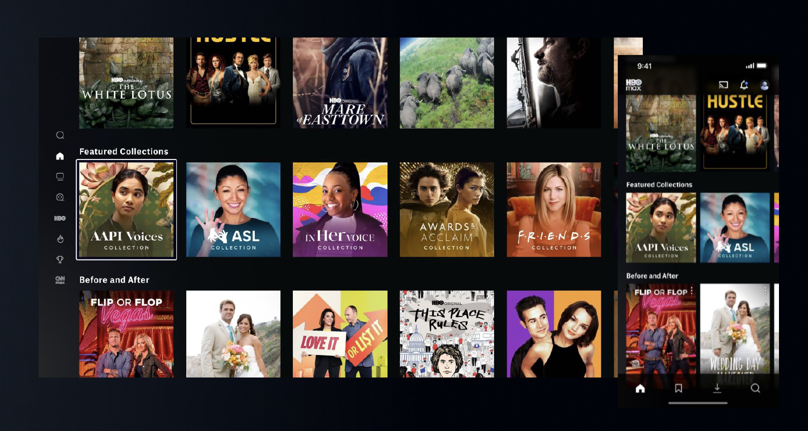
Collection Tiles
Our current collection tile treatment uses custom high touch imagery associated to the content with custom logos to create a premium look and feel.
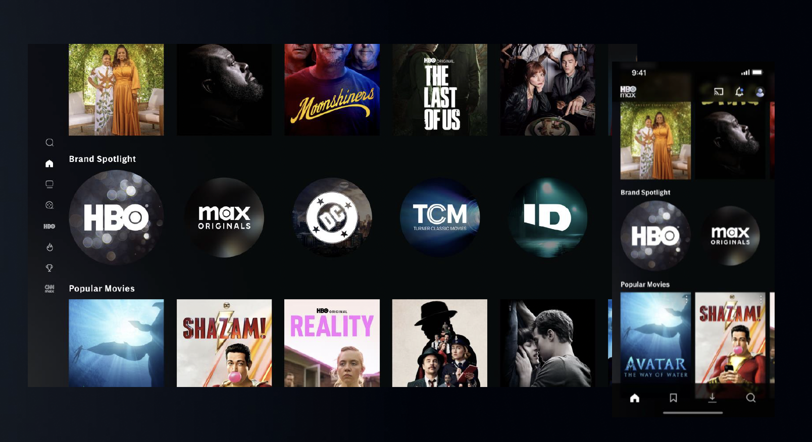
Brand Tiles
Our current brand tile treatment uses atmospheric elements associated with the brand , brand colors
and logos.
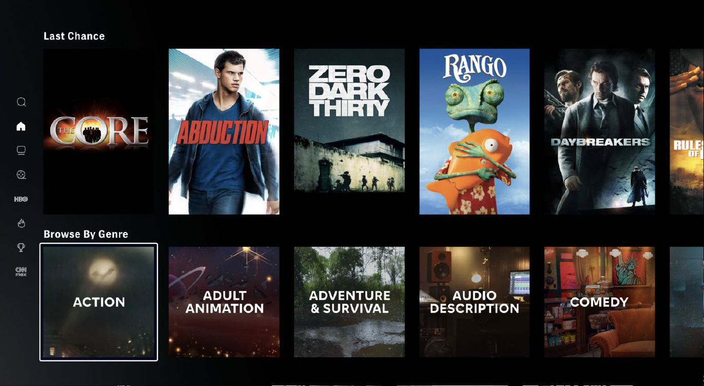
Genre
Our current genre tile treatment uses elements conveying the vibe of the genre, using environments from IP associated to the genre.