HBO Max
Editorial Design System
Role
Art Director (Co Lead)
Additional Credits
Design
Sr. Designer - Heather M
Product
Visual Designer - Natalia
Product Manager - Hakha M (Co-Lead)
Leadership
Sr.Creative Director - Matt S.P
Product Director - Michael M
About
This system was first collaboration between the brand design, product content expression, and core teams, serving as an internal incubator for innovation in the HBO Max app. The design unifies branding, lifecycle, and merchandising into a single cohesive visual experience, ensuring that every touchpoint—from the home screen to detail pages and collections—reinforces the premium quality of the experience and content.
The Brief
-
Design consistency
Balancing a unified visual style with the need for flexibility across many different components, content types, and use cases.
Ensuring that unique component styles still feel like they belong to the same overall HBO Max design system.
-
Component uniqueness
Defining visual rules so each component feels distinct and purposeful without creating visual noise or redundancy.
Avoiding overlap between component styles as the library grows and new patterns are introduced over time.
-
Scalability and global use
Building a system that can scale across campaigns, markets, and languages while preserving clarity, hierarchy, and brand recognition.
Accounting for regional content priorities, localization needs, and varying marketing strategies without fragmenting the core design language.
Example COMPONENT design process
Showcase the iconic moments from our
series and movies.

Create a distinctive mood and communicate
powerful emotions.
Title treatment and bug
Celebrate the epic nature of our motion pictures.
impact.
2 Webby Awards
34 million subscriber growth
/1
ATMOSPHERIC
Create a distinctive mood and communicate powerful emotions.
Aesthetic Principles
/2
LAYERED
Create cohesion across different visual elements.
/3
FOCUSED
Place talent at the center of the frame to convey their emotions.
/4
UNFORGETTABLE
Showcase the iconic moments from our series and movies.
Usability Principles
/1
READABILITY
Strong color contrast and font sizes play a vital role in ensuring that text is readable, especially for users with low vision.
/2
PREDICTABILITY
Designs should make it possible for users to accurately predict the outcomes of their interactions based on presented visuals and copy.
/3
ORIENTATION
Place talent at the center of the frame to convey their emotions.
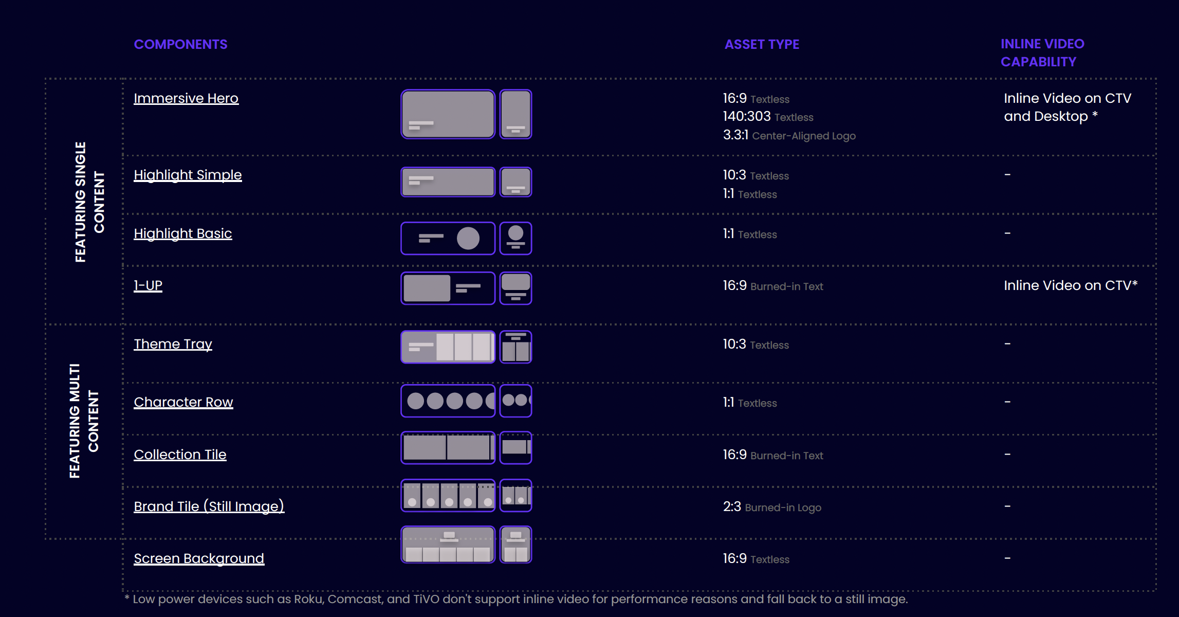
COMPONENT Design
Hero

Collection Tiles

Highlight

Avatars
Theme Rail
Select Campaigns
Black History Month 2022

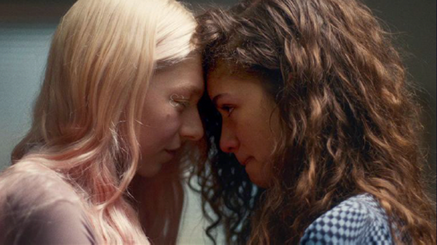
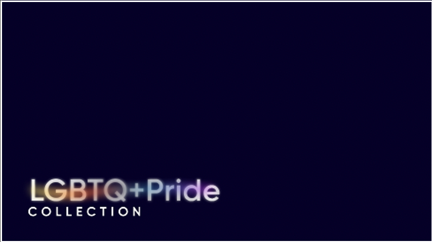
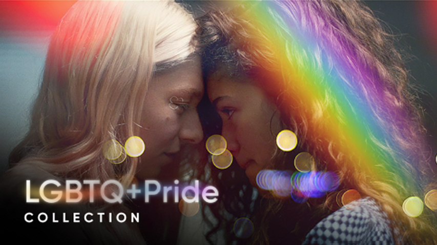
Pride Month 2022
Awards
Clio
2023
Webby - Visual Design
2022
Webby - Peoples Choice
2021